GRAPHIC DESIGN STUDIO - EST. 2011 - 42.48°N
Every detail,
dead on target
Visual Accuracy is a graphic design studio building brand systems, editorial, and packaging with obsessive precision nothing left to chance, nothing off the mark.
Logo Creation
Forge a timeless identity. Our futuristic logos channel the bold spirit of innovation, ensuring your brand shines as a galactic icon.
Website Design
Step into tomorrow. Our sleek, space-age websites blend visionary design with seamless functionality, creating an interstellar digital journey for your audience.
Packaging Design
Reimagine packaging. We craft designs that fuse retro-futuristic aesthetics with cutting-edge functionality, turning your products into stars of the cosmic marketplace.
Visual Identity
A mark that earns its place
A good logo is the beginning of everything else. It anchors the brand across every surface it will ever touch, from a business card to a shipping carton. My approach starts with the geometry, the letterforms, and the small proprietary details that separate a designed mark from a set typeface. Every wordmark is drawn on a grid, tested at every size, and built to hold up in one color, on any substrate.
CONCEPT
Target, aperture, and radar sweep. Three readings of precision in one mark.
Target, aperture, and radar sweep. Three readings of precision in one mark.
CONSTRUCTION
Concentric geometry on a fixed radial grid. Single break for motion.
Concentric geometry on a fixed radial grid. Single break for motion.
MARK TYPE
Combination mark. Icon legible at 16px; locks left of wordmark.
Combination mark. Icon legible at 16px; locks left of wordmark.
Let's build something that lasts.
Let's TalkThe web as a designed surface
A website is a brand in motion, and it deserves the same discipline as anything printed. From the type scale to the button system to the way a page breathes on mobile, every decision reinforces what the brand is trying to say. My web work is grounded in the same principles as the packaging: clear systems, precise typography, and details that reward a closer look. The site is often the first handshake with a future customer, and that handshake should feel considered.
An interior design brand with room to grow.
Built a full visual identity for an interior design studio that needed to feel as vibrant and confident as the spaces it creates. Designed the combination mark, developed a playful geometric shape system, and set a bold color palette that lets the brand stand out in a category dominated by neutrals. Carried the identity into a custom website that shows off materials, process, and personality all at once. The result is a brand that clients notice, remember, and want to work with.
COMBINATION MARK
Designed the layered "Esplendida" wordmark and mark.
Designed the layered "Esplendida" wordmark and mark.
BRAND SHAPE SYSTEM
Built a Memphis-style visual language for the identity.
Built a Memphis-style visual language for the identity.
MATERIAL SHOWCASE
Vibrant multi-color system tuned to an energetic brand.
Vibrant multi-color system tuned to an energetic brand.
A self-care brand that feels like the experience
Designed a brand identity for a multi-service self-care business that needed to feel premium without feeling clinical. Developed the monogram, set a muted gold and cream palette, and built a serif-led type system that gives the brand a calm, confident presence. Extended the identity across a website designed to book appointments, showcase results, and build trust before the client ever walks in. The brand now looks and feels the way the service is meant to.
LOGO / BC MONOGRAM
Designed the framed "BC" monogram and wordmark.
Designed the framed "BC" monogram and wordmark.
IDENTITY PALETTE
Set a gold-and-cream system for a premium self-care feel.
Set a gold-and-cream system for a premium self-care feel.
TYPE & VOICE
Serif-led identity carried across logo, web, and collateral.
Serif-led identity carried across logo, web, and collateral.
A contractor brand built on trust
Developed a full identity for a residential and commercial contractor serving a bilingual customer base. Designed the house-frame mark and wordmark, set a gold and slate palette that signals reliability, and built a system that scales from a business card to a job-site sign. Carried the brand into a bilingual website organized around the two things that matter most in construction: credibility and clarity of service. The brand now does the introductory work before the first phone call.
LOGO / HOUSE MARK
Designed the gold house-frame mark and wordmark lockup.
Designed the gold house-frame mark and wordmark lockup.
IDENTITY PALETTE
Callout headline anchored to the home's entry.
Callout headline anchored to the home's entry.
BRAND APPLICATION
Carried the identity from logo to web, badges, and footer.
Carried the identity from logo to web, badges, and footer.
Bring the next project to life.
Let's Work TogetherWhere design meets production
Packaging is the discipline where design and production meet in the open. A carton has to earn attention on a crowded shelf, communicate what the product is in a moment, and arrive at the manufacturing floor as a file that presses can actually print. This is the work I love most, refined across luxury consumer categories and regulated global products. Every project ends with a production-ready artwork system: dielines, spec sheets, and everything in between.
Cessio Brand
Regulated, Redesigned
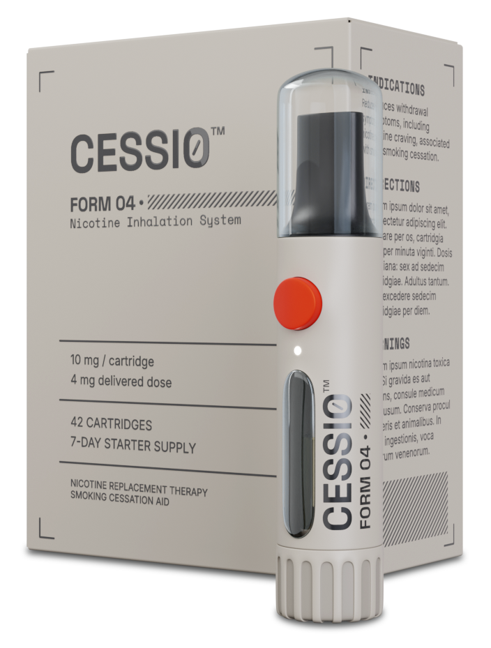
Cessio is a self-initiated concept for a nicotine replacement inhaler, developed to argue that regulated pharmaceutical packaging does not have to look clinical or cheap. The project covers the full system, from wordmark and industrial design to carton, dieline, and Quick Reference Guide, treating every surface with the same production discipline. Every specification is real, every deliverable is print-ready, and every decision is built to spec.
Cessio is a self-initiated concept for a nicotine replacement inhaler, developed to argue that regulated pharmaceutical packaging does not have to look clinical or cheap. The project covers the full system, from wordmark and industrial design to carton.
Tea Forte
Luxury tea, considered
Contributed to premium packaging systems for a luxury tea brand, including pyramid infuser cartons and the Matcha tin family. Worked across typography, illustration direction, and print-ready production, with a focus on how a product feels considered from shelf to table. Also produced photo-realistic 3D product renderings used across e-commerce and catalogs, enabling premium visuals before physical product was available. Craft, restraint, and production discipline, applied to one of the most crowded shelves in retail.
Contributed to premium packaging systems for a luxury tea brand, including pyramid infuser cartons and the Matcha tin family. Worked across typography, illustration direction, and print-ready production, with a focus on how a product feels considered from shelf to table.
What I care about
A senior packaging and brand designer with thirteen years of print production discipline across luxury and regulated categories. Obsessed with typography, print, and the small details that decide whether a design survives the manufacturing floor. Every project built to spec, from the wordmark to the dieline to the color break on press.
Let's make something
worth making
Bring the brief, the rough sketch, or just the idea. Every project starts with a conversation, and no idea is too early to share. Fill out the form and I'll get back within one business day.