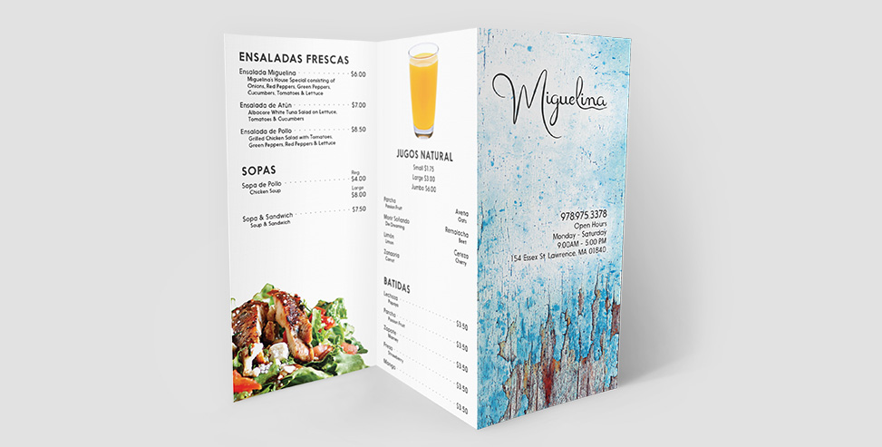
From the moment you pick up this Miguelina Restaurant brochure the first impression that stands out is the rustic texture that demonstrates hard work and time spent perfecting the culinary craft. Meanwhile, the clean layout and the blue color reflect the tranquility that the restaurant atmosphere has to offer.
1. Create a custom logo wordmark drawn in a script style.
2. Redesign their brochure to accommodate and complement the new look of the restaurant.
1. Different types of lettering were made by hand using pencil and paper. Thanks to the client’s feedback we arrived at a conclusion that defines their personality while at the same time doesn’t take away from its readability.
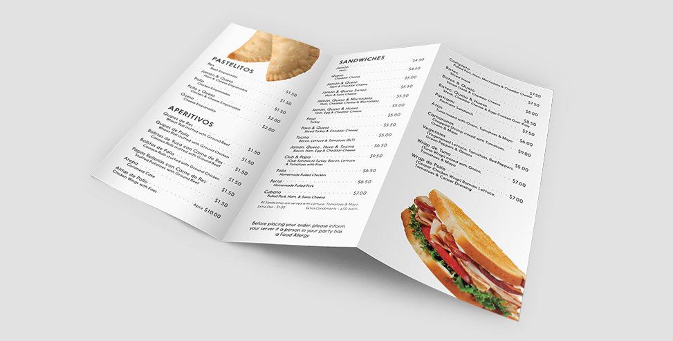
2. The restaurant’s appearance is a combination of rustic and modern style. The tables have a rustic and worn-out look of peeling paint at the top. The brochure’s front has the same texture as the table but on the inside of a clean modern easy to navigate layout.
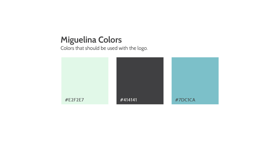
Take a look at these designs.